OldBill
Member
- Joined
- Aug 18, 2015
- Messages
- 591
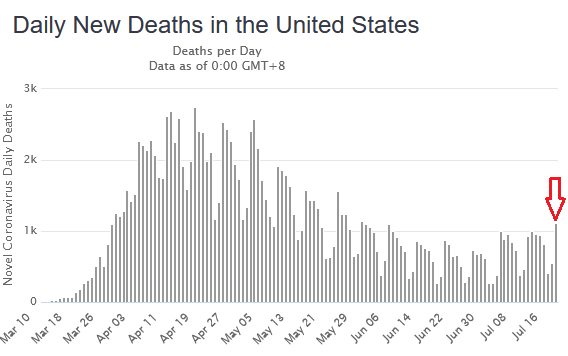
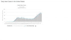
Just wanted to add some references to my prior post regarding looking at positivity rates vs just total cases or even total new cases. Total cases plotted logarithmically is a good measure. Naturally, cases are always going up; ie, "Number of new cases at an all time high" is every day and isn't exactly newsworthy. What matters is how fast, which is what a logarithmic plot shows.
Even better is a way to measure how we are doing vs the virus: is it becoming more rampant or are we starting to slow it "bend the curve"?
That's where plots of % positives as well as logarithmic new case plots play an important role. The number of tests are increasing, but in general, at a linear rate. This can be clearly seen in the same graph as % positives.
The GOOD NEWS: it appears the most recent surge is flattening (starting to peak) when looked at as a whole nation.
https://coronavirus.jhu.edu/testing/individual-states/usa
Even hard-hit states like Arizona:
https://coronavirus.jhu.edu/testing/individual-states/arizona
The problem of just accepting some statement of increases (even in rates) without looking at the data can be seen in Wyoming's chart. Here, the numbers are just too small and sampling is much less. Therefore, the plot is less smooth (higher uncertainty):
https://coronavirus.jhu.edu/testing/individual-states/wyoming
If guidelines and restrictions were followed as tightly as in the NE:
https://coronavirus.jhu.edu/testing/individual-states/connecticut
Finally, total cases, by state, with color coding for how fast new cases are being added:
https://coronavirus.jhu.edu/data/new-cases-50-states
One more way COVID has affected my plans. I have to monitor these trends to make decisions weeks or months away.
Last edited:


