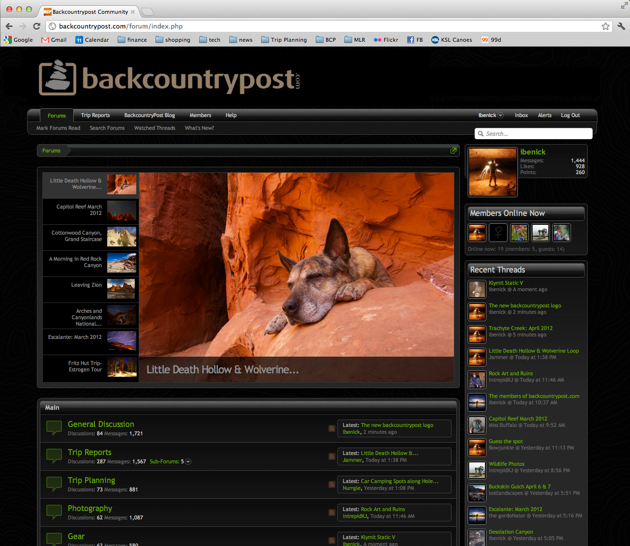
The new backcountrypost logo

Another mockup but with the new, more simple design. Keep in mind, the colors are flexible.

#38

bcp-mock2.jpg
 
And last thing for tonight... I REALLY, REALLY appreciate the input from all of you. I don't know why, but these kind of decisions are really tough for me. I'm so stoked to get to the end of this so I can start getting t-shirts, stickers, etc. rolling. :cool:
 
And last thing for tonight... I REALLY, REALLY appreciate the input from all of you. I don't know why, but these kind of decisions are really tough for me. I'm so stoked to get to the end of this so I can start getting t-shirts, stickers, etc. rolling. :cool:
I am kind of a homer for the original font and I like the design and color of #40, so I'd say #40 but use the original font. That's my humble opinion anyway.
 
The design of the cairn of # 40 is by far my prefered one, I like it very much : the shape of the cairn is nice and realistic, the fact that the cairn extends out of the square frame may symbolizes "outdoor", the 2 colors are more attractive than a global unicolor design.

For the font, I liked the original one (for .com I prefer the dot at the bottom as .com is oriented outside) but now I prefer the #40 one as it makes the global design lighter (less massive) and the name much easier to read (that's really important), especially if you look at it from quite far away (as it will be the case on stickers, T shirts...) or if you look at it when it is small (as on a smartphone, an Iphone, on facebook...). Maybe the same font could be squeezed a little bit, so the name would be a little less large for the same high.
 
I am kind of a homer for the original font and I like the design and color of #40, so I'd say #40 but use the original font. That's my humble opinion anyway.
I agree. I like Extrude's cairn much better & agree with Philippe as well in terms of font, though i do like the original font.
 
I'm liking some of the changes made to the original logotype in design #42 and #41. Not really into the swoops in it but the minor mods to the logotype...
 
#40 is definitively my prefered one with maybe 2 modifications : the same font a little bit squeezed (the word would be less long but with the same high) and the use of the same grey color than the cairn for .com or for post.
 
Perhaps what's bugging me about Extrude's cairn is that it is pretty much taken from the cairn that started me down this idea. I've been working on a website redesign at work and I used a cairn for the graphic for the new staff page. That was when I thought to myself, crap, that would be an awesome logo for BCP.

So check out the cairn that it was taken from. What I don't like about it is that a strong wind would topple it in a second. But I also get that those cairns that are less stable looking often draw my eye on the trail. Decisions..........

Screen Shot 2012-04-14 at 8.31.52 AM.png
 
The design of the cairn of # 40 is by far my prefered one, I like it very much : the shape of the cairn is nice and realistic, the fact that the cairn extends out of the square frame may symbolizes "outdoor", the 2 colors are more attractive than a global unicolor design.

For the font, I liked the original one (for .com I prefer the dot at the bottom as .com is oriented outside) but now I prefer the #40 one as it makes the global design lighter (less massive) and the name much easier to read (that's really important), especially if you look at it from quite far away (as it will be the case on stickers, T shirts...) or if you look at it when it is small (as on a smartphone, an Iphone, on facebook...). Maybe the same font could be squeezed a little bit, so the name would be a little less large for the same high.

Agree with #40. I like the 4-rock cairn and the font is easy to read. I can see having this embroidered on the back of a pack or something.
 
Do you guys prefer the rounded corners on Extrude's logo like in #40 or squared like in #36?
I like it more rounded. Nothing in nature is sharp like the box corners in #36.
 
Back
Top