Navigation
Install the app
How to install the app on iOS
Follow along with the video below to see how to install our site as a web app on your home screen.
Note: This feature may not be available in some browsers.
More options
Style variation
You are using an out of date browser. It may not display this or other websites correctly.
You should upgrade or use an alternative browser.
You should upgrade or use an alternative browser.
The new backcountrypost logo
- Thread starter Nick
- Start date
Yellowstone 1
Blah!
- Joined
- Jan 23, 2012
- Messages
- 601
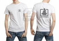
Yeah not liking dude with hand on ass.
 Like the logo though. What's your take on a hiker or boot print logo for the shirt?
- Joined
- Aug 9, 2007
- Messages
- 12,967
Yeah not liking dude with hand on ass.Like the logo though. What's your take on a hiker or boot print logo for the shirt?
Haha! Yeah, the selection of images I could steal off of google image search was limited. I was going for a hot babe as the model but failed miserably!
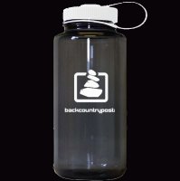
I'm all about having lots of different designs for shirts and such. Even that tree from the water bottle.
Yellowstone 1
Blah!
- Joined
- Jan 23, 2012
- Messages
- 601
I think that would be a good idea for the shirts, especially for branding purposes to bring people to the site because a newby might not look at a cairn the way they would a hiker etc.....Haha! Yeah, the selection of images I could steal off of google image search was limited. I was going for a hot babe as the model but failed miserably!
I'm all about having lots of different designs for shirts and such. Even that tree from the water bottle.
Deadeye008
Hambone
- Joined
- Jan 18, 2012
- Messages
- 742
I like these two. I can't decide between the two different fonts but I'm leaning towards the new font. I like what he did with the box in these two and I like the two-tone look.
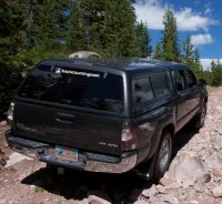
Some mockups...


Deadeye008
Hambone
- Joined
- Jan 18, 2012
- Messages
- 742
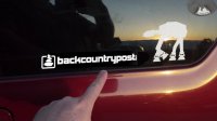
Cool! When can I get a sticker for my Jeep!!??
Philippe
Member
- Joined
- Jan 30, 2012
- Messages
- 194
We have a winner....
View attachment 2055
Really a nice one ! The winner has everything that I prefered among the different tries (4 Stone cairn going outside a square, font, colors...).
Bob Palin
Killer
- Joined
- Feb 9, 2012
- Messages
- 161
Nice, so glad to get rid of the upper case R - stabbed me in the eye every time I saw it. (The other upper case letters were not as bad but greatly prefer this style.)
leatherman
Huh?
- Joined
- Jan 24, 2012
- Messages
- 138
Very cool. And I see you've updated the forum header.
- Joined
- Aug 9, 2007
- Messages
- 12,967
Cool! When can I get a sticker for my Jeep!!??
Working on it!
Yvonne
I lava it!!!
- Joined
- Jan 19, 2012
- Messages
- 4,168
It rains in this park 275! Days of the year. Doesn't feel like Utah.
at least it is warm year round.
I actually have seen the park without rain, might be a rare sight, but it happens one in a while.
Don't like ads? Become a BCP Supporting Member and kiss them all goodbye. Click here for more info.

