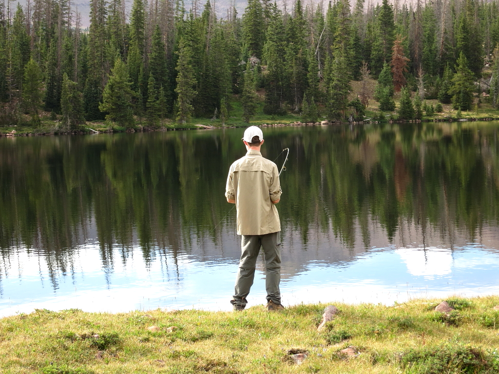
Here's a quick and dirty example of how post processing a raw image can help provide some pop. I'm by no means a professional and this is not meant to indicate the "right" way of doing things... only the method by which I currently process most shots.
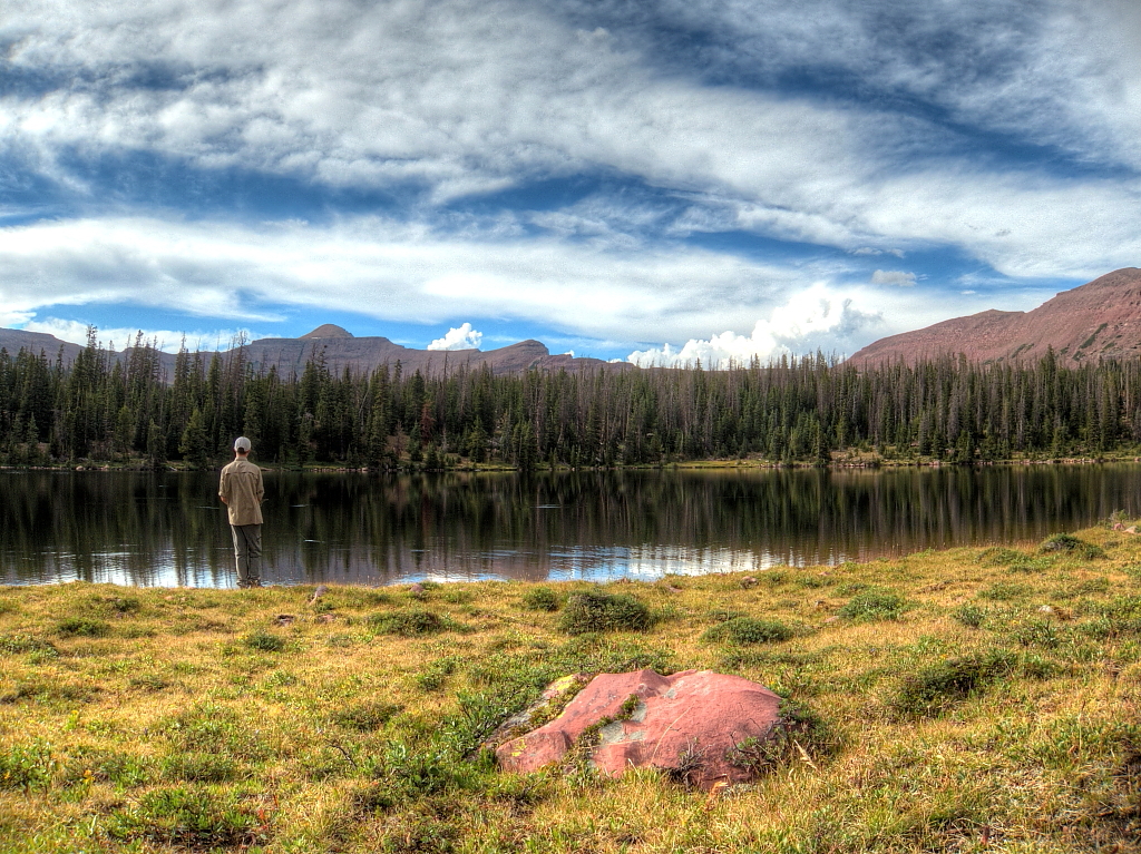
Start with the unprocessed raw file.

It's okay, not great. There are some dust or water specks visible in the foreground. The background is a little cluttered and overly bright. The highlight in the center of the image is blown out. Enter Adobe Camera Raw.

Looking at the histogram in the upper right-hand corner, I can see both the highlights and shadows clipped. The first step is too add a bit of saturation and even out the highs and lows. ACR allows us to find out exactly where the trouble areas are. I'm also going to warm the image by touching up the white balance.

Since the overall exposure isn't out of whack, I'm going to ignore the exposure, brightness and contrast controls. Instead, I'll use a bit of recovery to tame the highlights and pull back on the blacks to reveal the shadows.

The goal here isn't to go overboard, just to dial in enough correction to mitigate the problems. Now on to lens correction. The Canon EF-s 10-22mm exhibits some distortion at 10mm, as well as some faint chromatic aberration. ACR has a built-in profile for this lens and will correct for both problems with a single click. I've added the vignetting back in because it is subtle and adds to the image, in my opinion.

Next, I'll set up some capture sharpening. This is what your camera does when shooting JPG. Done right, the effect will be subtle. Sharpening isn't so much about fixing blurriness but instead increasing the overall "crispness" of the image. More dramatic sharpening effects can be had later in the process. Likewise, I've added a touch of luminance denoising. Since this was shot under decent light at ISO 100, there's little noise with which to contend.

Now to the curves. Beautiful curves. This is where a lot of the magic happens. We're going to tweak the contrast here a bit by bumping up the lights and darkening the darks. Notice that while this has improved contrast, it hasn't pushed our highlights or shadows into oblivion again. A soft touch.

Another great way to tweak contrast or bring out some emotion is by manipulating the individual colors. By boosting or cutting saturation of single colors (as opposed to the whole image) we can highlight specific parts of the image.

The same works for luminance (the bright/dark balance of the color). A tip for dramatic skies: boost the blues while also drawing down their luminance.

So far our edits have been global. But ACR and other RAW processing tools also allow for non-destructive spot correction by way of the Adjustment Brush. That's this guy.

Remember where I said the background was messy and overly bright? Now we're going to fix that by selectively darkening and blurring the offending areas.

Using the brush, paint in the areas to be affected by the settings you choose. The Adjustment Brush and it's cousin the Graduated Filter tool are very powerful. You can see the portions of the image to be impacted using the mask.

At this point, the image is fairly presentable. You could save out a version and it would be okay. But there are a couple little additions to be made in Photoshop. Open the image in PS. It has several good tools for dealing with those nasty gray spots, but I go the old school route and use the clone stamp. Place the clone on a new layer so as not to ruin the underlying layer with a bad clone job.

Before correction...

...and after. Good improvement.

Now for some more sharpening. This is where sharpening can be a bit creative. I want to highlight the foreground elements by using some local contrast adjustment. Unsharp Mask is a great tool for this.

I'll paste Layers 1 and 0 together into a new layer and apply the filter, then use a mask to blend it in just where it's needed. Use a large brush with little to no hardness so that the effect feathers off nicely. Also, a low opacity with multiple strokes will help make sure it's subtle and blended well.

Take a look at the mask on the layers panel to see how I've only drawn the sharpening in on specific parts of the image (white is where the effect is applied).

Now we're really getting some depth to the picture. I'd consider this presentable. Sometimes though, a little burning and dodging can really bring things together. In order to do this non-destructively, I'll use new layers with the overlay blending mode and paint on them as if they were masks.


Finally, just a hint of final contrast adjustment using a curves adjustment layer. This is not always necessary if I nailed it earlier in ACR. I usually use PS's linear contrast preset, then dial down its strength using layer opacity.

Up to this point, we've been editing a very large file. By working in 16-bit, we've ensured that color gradients remain smooth and free of posterization. But web graphics are 8-bit so we'll step that down... and resize to a more web-friendly (or at least desktop background-friendly) size.

Personally, I like editing in Adobe RGB color space because of its wider gamut. But many browsers will fail to render this properly, so I'll swap to sRGB as a final step before saving a web-friendly version.

JPG that sucker and we're done.

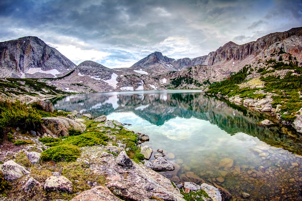
Our image weighed in at a scant 800k. Now for the finished product.

Compare again to the original, unprocessed file.
Now upload the masterpiece to Flickr or your web service of choice and obsessively refresh, wondering why it's not racking up hundreds of hits.
.jpg")


.jpg")