Changes to BCP

Do you think it's time to kick the cairn and create a new logo?

  • Yes, knock it down

    Votes: 11 64.7%
  • No, leave it, I can't handle change

    Votes: 4 23.5%
  • Other - leave a comment

    Votes: 2 11.8%

  • Total voters
    17

Nick

-
.
Joined
Aug 9, 2007
Messages
12,951
Hey everyone! It's been quite a while since I've posted much here but I've still been here in the background doing my thing. I just came back from a 4-month road trip to Alaska, and wow! I'm going to break my trip report dry spell for this one. At the very least I'm going to post a trip report from my 3-days in Katmai back in July.

But today I am here to ask for opinions and input from everyone here. I believe the time has come to refresh the look and feel of Backcountry Post and along with that, I think it's time to finally kick the cairn down for good. Back when the logo was created in 2012, the cairn felt more applicable to backcountry travel and far less cringe-y than it is today. But the explosion of unnecessary cairn building in the outdoors has cast a shadow on that and I think it's time to just kick it down and start fresh.

I'll be working in the background over the next month or two on this redesign but I wanted to start it off by soliciting you all for your thoughts, opinions, and creative ideas. What do you think would better represent the site? Do you like the dark background theme or the light background?

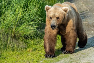
Oh, and here's a teaser from my Katmai trip. We drove almost 12,000 miles and spent 115 days on the overall Alaska trip and saw more bears than I can even count. More to come!
DSC03733.jpg
 
I agree with the sentiment. Even though I just got back from a trip where cairns were actually pretty necessary for navigating a very little used "trail," it seems like 99% of cairns are not actually useful or warranted.

We've got a healthy combination of mountain and desert backcountry love on here, so something that incorporates both of those would be cool.

Also I like the dark theme, but it's not a must for me.

I'm going to break my trip report dry spell for this one.
Woohoo!
 
How about a grizzly bear paw print? I am a bit biased though. :D I kind of like Jackson's idea of mountains and desert, maybe within the outline of a shield, with a tiny grizzly print where the images come together at the top of the shield. :)

I like the dark background, but see the functionality of being able to switch a good thing.

Being able to click on the image in the slideshow and have it take you to that post like it used to would be nice to have back.

Being able to rotate an image in BCP would be nice. Some of my older point and shoots don't rotate automatically, and sometimes I like to just bring in the photo straight into BCP, but it isn't rotated correctly. Along those same lines, would it be possible to resize an image on the fly while bringing it into BCP - maybe three standard formats - small, medium, large? Something that your website could handle. Again, I like to bring in shots from my larger sensor cameras, but they are too large.

Being able to see in the topics, or perhaps latest posts, the members who actually posted the original post, as well as the latest person who has responded to the post would be nice.

No complaints, just thoughts. Love the site and the folks who contribute.
 
+1 for manual rotation, or else proper auto-rotation (currently some of my iPhone pics come out upside down and I can't fix it!!)

Nick do you mind linking to the software that sits behind this site? or I guess I could figure this out myself probably. but anyhow, I'm curious if the latest version gets rotation right
 
Nick do you mind linking to the software that sits behind this site? or I guess I could figure this out myself probably. but anyhow, I'm curious if the latest version gets rotation right

We are on the latest version of the software, which is XenForo. As I do the updates I'll see what kind of third party improvements are out there for image handling.
 
Perhaps I'm a fringe case because I live outside for months on end, but dark mode is impossible to read on a phone screen in bright-ish sunlight. So having a light mode option, for me, is almost mandatory. On the other hand, dark mode is a much better viewing experience for photos whenever I'm inside, esp on desktop. I really like having both.

I personally don't really give two hoots about the logo either way, but I can intellectually understand where folks might find it to give the wrong impression of how to behave in the backcountry. As long as you don't change it to a drawing of "BCP" carved into an aspen, I'm good. :)

Edit to add: Considering your significant creative bent, you probably don't actually need my suggestions about a new logo... but I've always thought that a line drawing of the La Sals towering over the Entrada formation is super iconic and might serve as a good synopsis of what this site is all about.

Finally, welcome back to yer own site! I'm looking forward to seeing the fantastic adventure you've been up to.
 
Last edited:
but I've always thought that a line drawing of the La Sals towering over the Entrada formation is super iconic and might serve as a good synopsis of what this site is all about.

That sums up almost perfectly what I have in mind, and what I've been sketching up. A mountain scene flowing into a desert scene in a very simple design. And thanks for the welcome back!

Oh, and to all on the dark vs. light. I'd say 100% that we'll always have both options, but I am leaning toward making light the default option for new traffic arriving to the site.
 
Now have to second Scatman's thoughts with a Grizzly Bear print. The thoughts of a mountain and desert like scene sound really great also. But yes do think the cairn has to go. You are the boss so whatever you want then go for it! Looking forward to your trip reports!
 
I take a number of panoramic photos on my iPhone but they are always too large to post on BCP. I’ve tried to resize them but have been unsuccessful. So it would be nice to be able to post them without having to jump through hoops to resize them.

I’m open to any logo. As an East Coaster I’m in the minority here so I’m good with whatever you cook up (thinking of the suggestion of the La Sals towering over the Entrada formation).
 
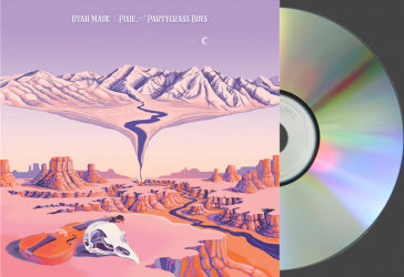
Maybe you can get some inspiration from this Album art. Of course it has way too much detail for a logo and copying too much would be a no no. Just the essential elements could work. I wish that I had a poster of this scene.Screenshot (199).png
 
Great to see you back Nick! I look forward to see your photos.
Thank you for keeping the site up and running, while you’re on such a mega trip! Thanks also to the moderators :)

+1 for resolving the issue with some iPhone photos uploading sideways. I only use the dark mode. Agree with Jackson.
 
Thanks for providing the platform/support for such a great forum @Nick !

I actually prefer the "dark mode," but that has a lot to do with when I'm perusing the website. I visit a lot during the evening/early morning hours and the darker background is much easier on my eyes. It would be nice to have a brighter/daylight option as well, but if I had to choose I lean towards the dark side.

If you design a new logo I'll have to update my collection of BCP gear. That is good marketing. :)

Incorporating a trail fading into your mountain/desert scene is a thought; not the easiest thing when trying to keep it simple. If you are trying to leave the "people" element out of the design that makes sense too.
 
115 days on the overall Alaska trip
An impressive amount of time! Looking forward to your TR(s). Great site - great people. Thanks for making it easy to exchange knowledge and experiences.

Personally like a dark theme - easier on the eyes IMO.
 
Welcome back, Nick! Looking forward to lots of trip reports. Thanks for all you do in the BCP "background." Great community!!!!
 
I voted to change the logo, but certainly don’t mind the cairn. I think it is very appropriate to what we do on the site, as I am ambivalent to both cairns and posting beta on the internet. Love the site though, just sayin’.
 
Back
Top